
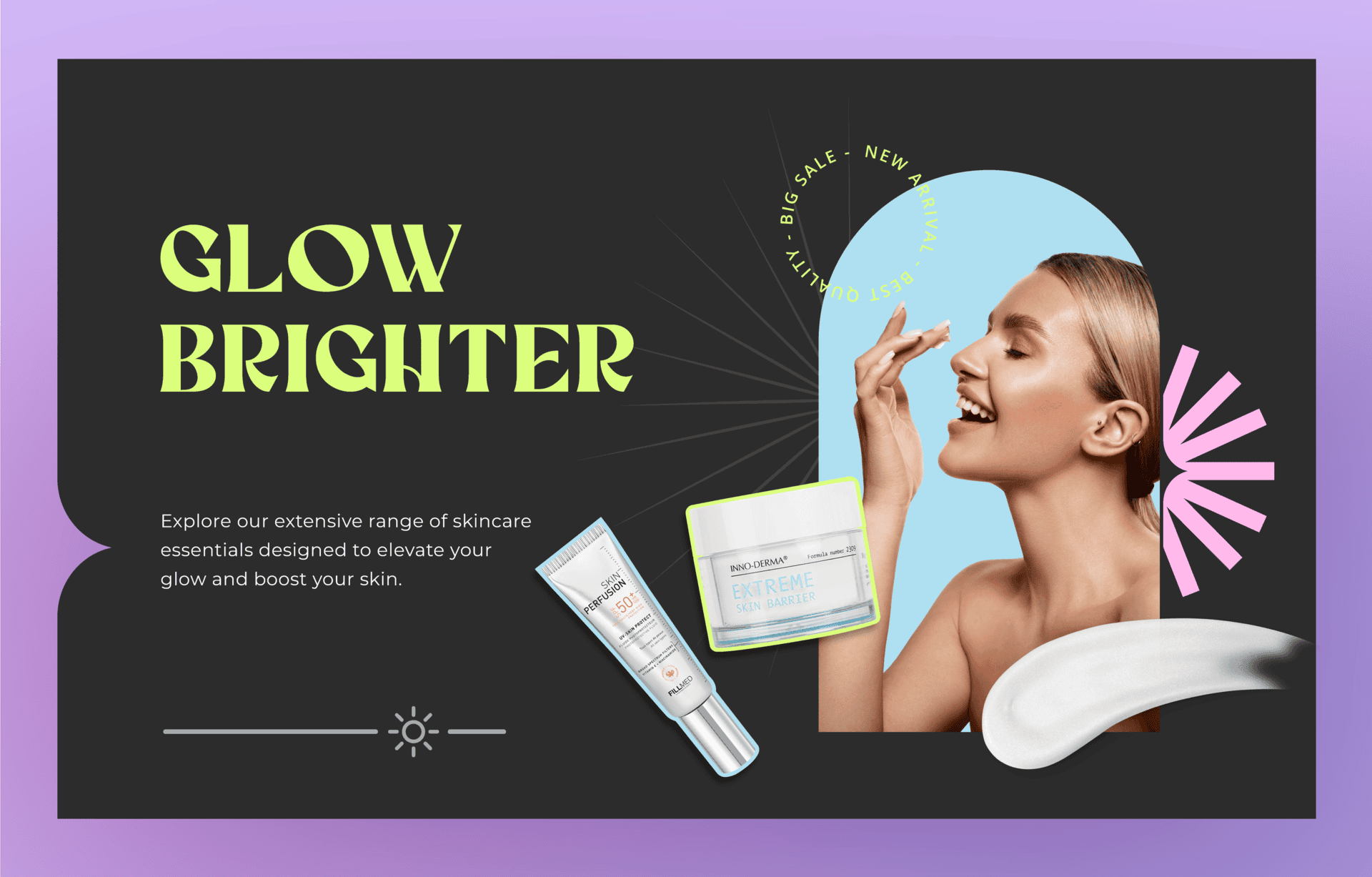
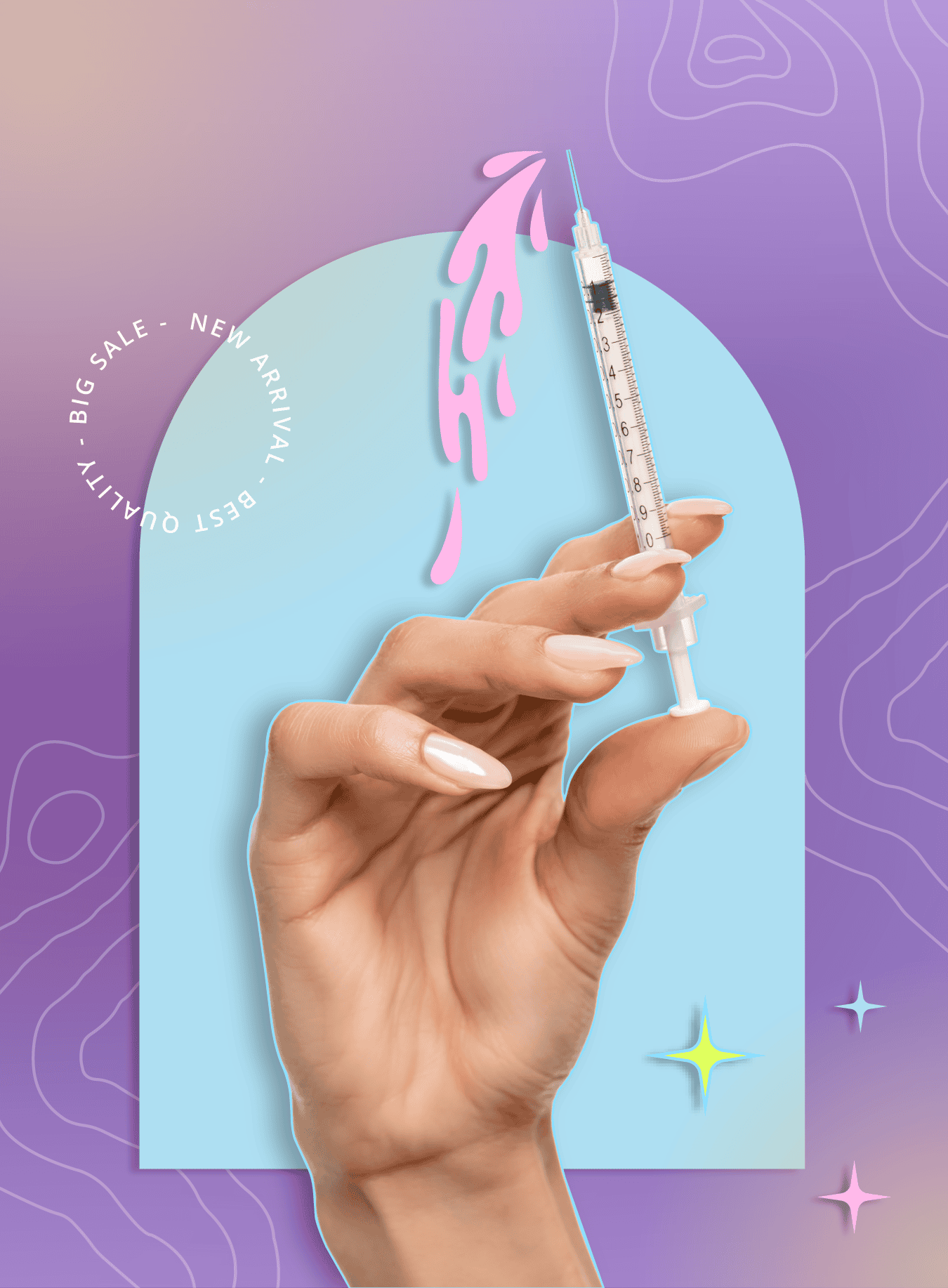
For Cosmo Direct Supply, a global distributor of professional beauty and aesthetic products, the goal was to create a set of web banners that felt both credible and visually appealing. The challenge was finding the right balance between a clinical, professional look and something that still felt modern and beauty-focused.
I started by experimenting with different colour directions, testing bolder tones and higher contrast palettes to see what worked and what didn’t. Through this process, it became clear that a simpler, cleaner approach communicated the brand much more effectively.
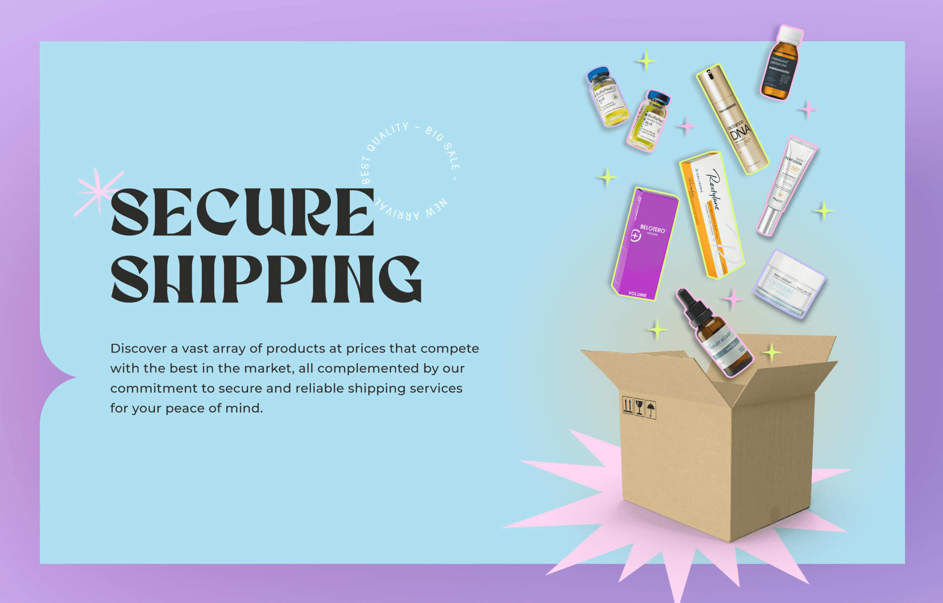
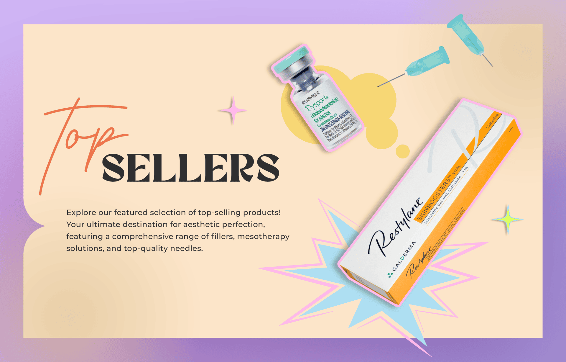
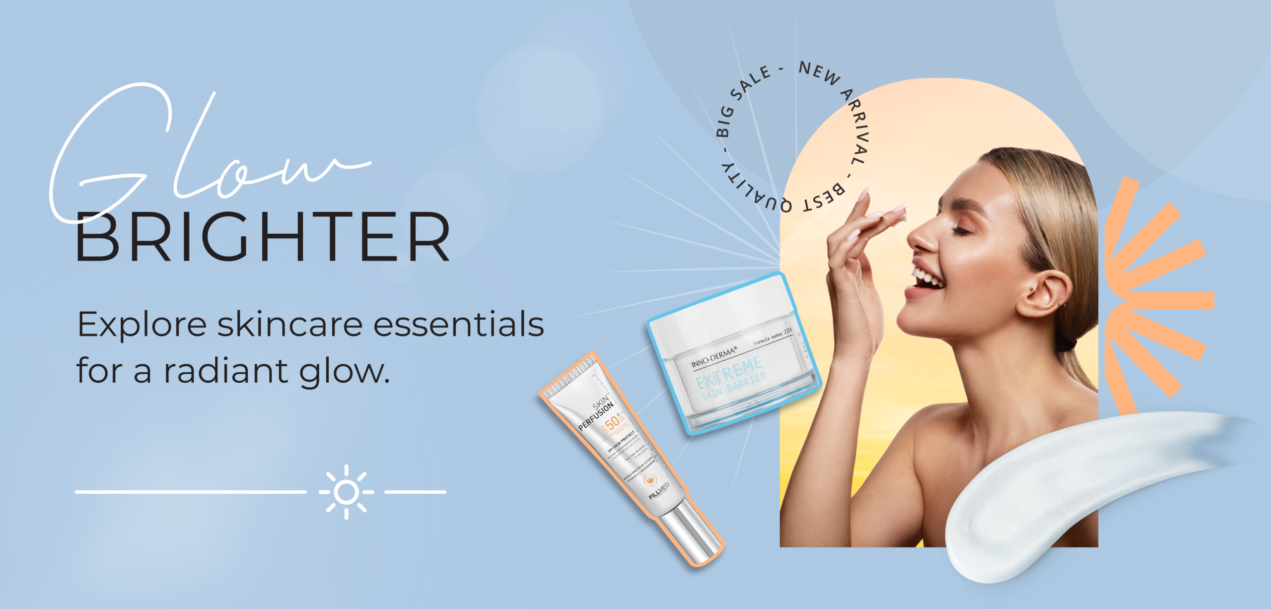
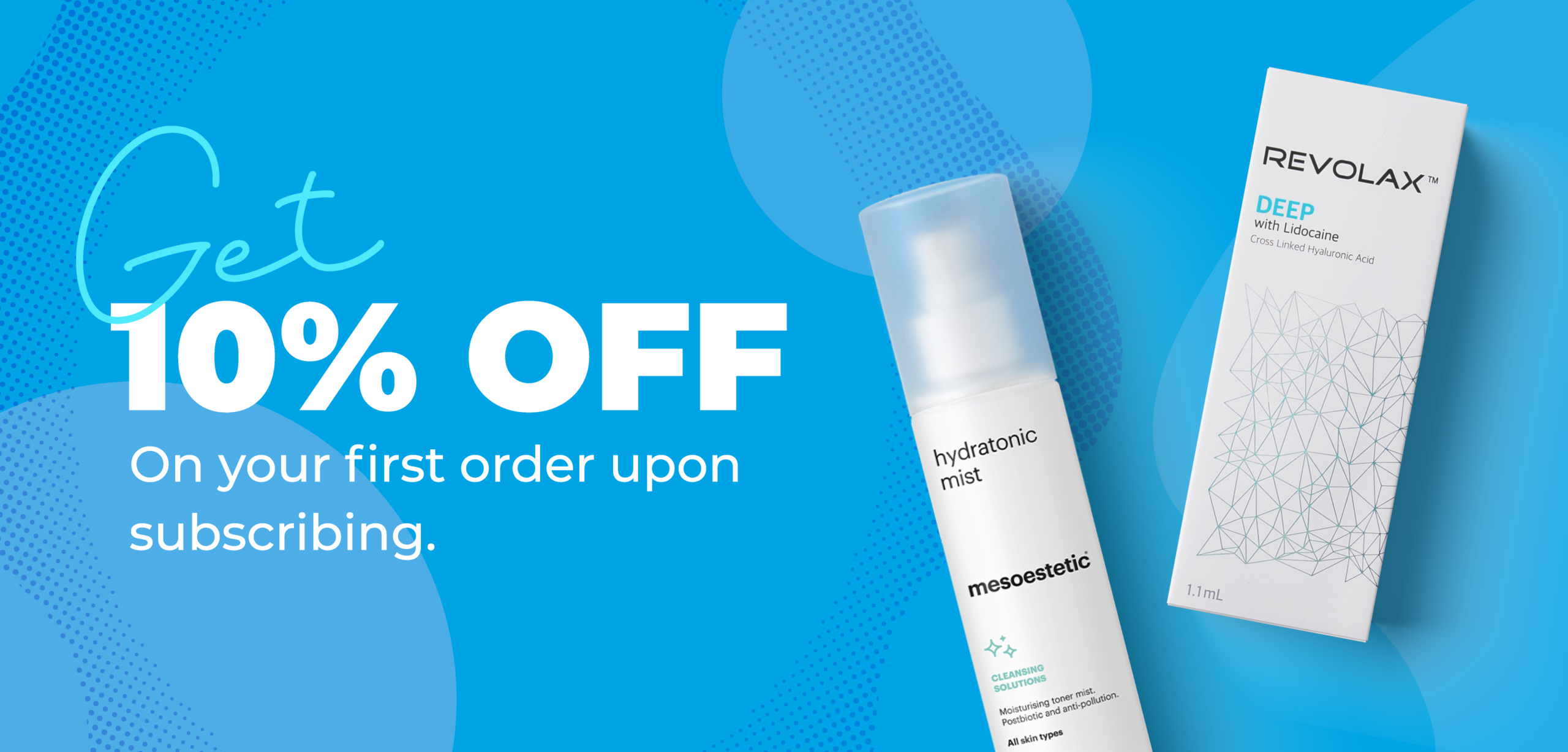
We landed on a light blue colour palette, which conveys trust, freshness, and professionalism. It also allowed the product imagery to stand out while keeping everything cohesive across the banners.
For typography, I combined soft script elements with clean, modern fonts. This helped introduce a sense of elegance without losing clarity or structure. Subtle graphic details and thoughtful spacing were used to keep the layouts interesting while still feeling minimal and easy to navigate.
The final outcome is a series of banners that feel clean, confident, and contemporary, helping position Cosmo Direct Supply as both trustworthy and visually aligned with the beauty industry.